By: Hania Karadimov
Photography: Ilkka Saastamoinen
Lotta Nieminen has designed everything from postal stamps to Moda Operandi’s logo to the background of your Google calendar app. After working at some of the most prestigious design agencies in New York, she decided to strike out on her own. But whether she’s illustrating a kids’ pizza recipe book or creating a window display for Hermes, she tries not to think about the scale or prestige of the assignment, because that can be paralyzing. A project is a project. “I really try to create work with similar attention and similar thoughtfulness, whether it’s for a large brand or a much smaller one,” she says. And, like so many others, she still has impostor syndrome. “I'm Finnish — we can’t say we’re good at something, it’s in our DNA.”
“I find it really satisfying when I have an aesthetic experience, whether it’s a considered piece of art or something I found by accident.”

Sketches inspired by Yasujirō Ozu movies
Hania Karadimov: Where do I find you right now?
Lotta Nieminen: I’m currently in Paris. While for the past year my husband and I have lived between New York and Paris, the pandemic made us stay here a bit more steadily.
H.K.: We are all confined in our homes. You once said that you get inspired by stepping away from your desk. Has that been a struggle?
L.N.: It has, and it hasn’t. I’ve just had to look for inspiration in different ways. We watch a lot of both old and new movies, and I’ve ordered a ton of different books on topics that I find interesting, like this monograph of Dutch graphic designer Karl Martens. I’ve also really gotten into the Japanese director [Yasujirō] Ozu. His imagery is so compelling, so thoughtfully arranged. It’s really mind-blowing. When we were in strict lockdown in the spring, and we weren’t stepping out, not even for walks, I came up with little things to do, like drawing by hand these little vignettes and scenes from some of his movies.
I think I’ve just had to turn a little bit more inward to “step away” from the desk, the computer, which has been a really interesting exercise in a lot of ways. I thought I was inspired when I had a lot of things going on, but now the quiet lets me hear my own thoughts. Work has slowed down, which is good, because I’ve also slowed down a little – I can’t produce things as quickly as I used to. It’s nice to take your time and sit with things.
H.K.: Now you’re in Paris, you’ve lived in New York for many years, and in Helsinki. Cities often show up in your work – most notably in your children’s book Walk The City. How do these different places inspire you?
L.N.: It’s generally something that’s easier to see — like most things in life — with a little bit of distance. While I don’t think I have an aesthetic that’s very Finnish, or very New York, or very Paris, I feel like I understood, for example, the Finnish in me much better after I moved away. And now, having some distance to New York, I see how it affected me. But I also don’t think it shows in my work in very clear ways. It’s more apparent in the thinking behind the things you want to do and the goals you want to achieve through them.
I hate country-based design stereotypes, but if you take Finnish design, you think of clean lines and simple shapes, and an orderly style. I have some of those components in my work. Obviously, not all Finnish design is like that, it’s kind of cliché, but I do recognize that sort of minimalism and straightforwardness in my work. And New York brought color into my work. Color has always been something that’s extremely interesting to me. In the beginning, I was mostly able to use it in my work as an illustrator. I developed this very colorful, detailed style, while my graphic design was much more pared down. But after being in New York for a while, it started seeping into the branding work as well. Now I also wonder whether I’m using more color in my graphic design because I started scaling down my illustration work.
H.K.: Are you scaling down illustration because you want to or it’s kind of the nature of the assignments and commissions you’re getting?
L.N.: I want to — and that’s something I’ve struggled admitting to myself for a while. I don’t want to stop being an illustrator, it’s not definitive. But I’m putting it aside. Earlier in my career, I could feel that my illustration style was evolving with every assignment, which kept the work interesting and challenging. But after a certain point, it got stylized to a point where I felt like I painted myself into a corner. There was not really room to do anything but to execute that style. I felt like I was just doing the same illustration over and over again, and it stopped bringing me joy and the satisfaction that happens when you do work that moves you forward. I wanted to make room for graphic design work where I felt like I still was developing, getting better. So I put it aside, and actually I find that now I’m using more illustration in my branding work, in styles that are completely unrelated to what I was doing before.


H.K.: I do want to bring up your illustration work, however. You’ve made some beautiful, fun books for kids, like your Cook in a Book series, and you’ve done design work for kids’ brands, like Maisonette. How do you think about what will resonate with children?
L.N.: I don’t have children of my own, so I try to think of things that brought me joy as a child. We had these books by Tove Jansson that I loved as a kid, especially “The Book About Moomin, Mymble and Little My.” It’s a picture book with die-cut holes featuring the Moomins, and it’s so beautifully done, so beautifully printed. A child doesn’t know whether something is good or bad design, but in hindsight, I think it’s so nice that something so extremely considered was made for children. Having access to such beautiful imagery as a child became a really important part of who I am today – I think it had a huge impact subconsciously. I want a children’s book to be fun, informative — it’s really important for me that it’s never dumbed down just because it’s for children — but also want to be of a nice piece of design. I want it to be something that parents also find appealing because they’re the ones who have to read it over and over, thirty times in a row.
H.K.: You come from an artistic family. Do you think your parents would actually pick out books and show them to you based on how beautiful they were?
L.N.: It was probably a mix — there were probably also much less considered books in there that we enjoyed very much. I don’t think we had a curated library, but my parents were about appreciating nice aesthetics. My mom is a fine artist, and she was very adamant about giving us really good drawing tools. When I would come home from kindergarten, she’d have clean paper sheets, and she’d sharpen our pencils, check our Sharpies so that they were still coloring. That’s also something you think kids wouldn’t care about, but I think having tools that are actually good is hugely important.
H.K.: You said once that you ended up doing design and illustration because of the way you see the world. How would you say you see the world? Are there certain things that you think you notice that other people don't?
L.N.: I don’t think I have any kind of singular skill (I’m Finnish — we can’t say we're good at something, it’s in our DNA). But there are things that I like to look at and things I appreciate. I’m constantly paying attention to light, color, shape, and texture. They’re like sounds to me – I don’t have synesthesia, but just like we humans can’t ignore a loud sound, I find it hard to overlook color. I feel like I’m constantly looking for these things and noticing them because they just bring me a lot of joy. I find it really satisfying when I have an aesthetic experience, whether it’s a considered piece of art, or something I found by accident.
H.K.: Your work encompasses a vast array of products and brands — you’ve designed a tote bag for a band, wine labels, pillows, books, a coffee tin, branding for Google. Do you have one design philosophy or do you approach everything project by project?
L.N.: I am extremely inspired when I work in multiple disciplines. When you do too much of something in a very similar way, you refine the craftsmanship, which is what happened with my illustration work. But what interests me more than craftsmanship is having a fresh point of view on what I’m doing. And for me, that’s easier to achieve when I switch things up with each project. It’s so inspiring, especially when it’s something that I’ve never done before. When I designed my first e-commerce website, it admittedly looked a bit horrible, but there was also something fresh about it. I didn’t know the rules, I didn’t know that it was supposed to be specifically this or that way. It creates this child-like approach, which is less about abiding by strict rules.

Lotta’s early childhood doodles
H.K.: Let’s talk about your work for Google or Facebook. You’ve designed graphics that millions of people interact with every day, whether they notice them or not. Do you think about that kind of work in any particular way?
L.N.: I really try to create work with similar attention and similar thoughtfulness, whether it’s for a large brand or a much smaller one. If I’m always thinking about the scale of the project, it just puts me in a block. My impostor syndrome gets easily triggered, so for me, it just helps not to think about it. Because sometimes, when I start on an assignment, especially if it’s for a brand that I’ve really longed to work for, I can very quickly get the feeling of standing on a cliff, and thinking “How? Why would they think I can do this?”
H.K.: Which of your projects has been a particular dream to work on?
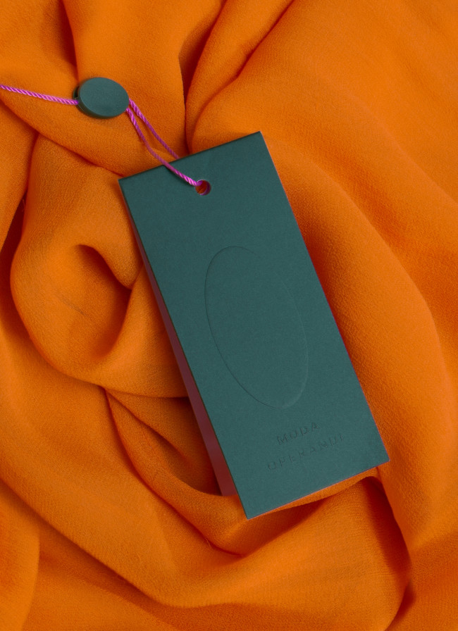
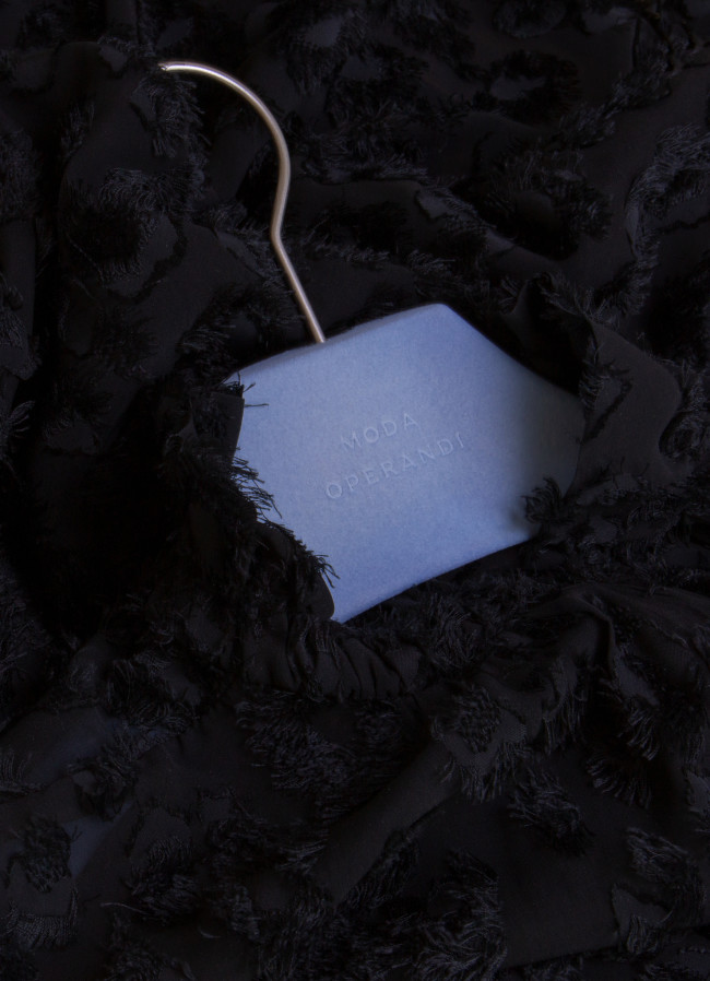
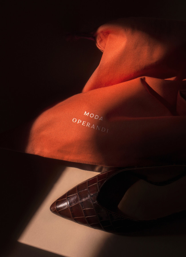
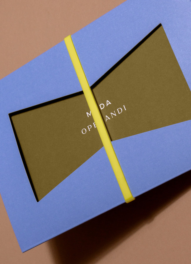
L.N.: A recent one was the [luxury e-commerce platform] Moda Operandi rebrand. I’ve purchased things through their website, I’m very familiar with the brand. I couldn’t believe they let me use so much color at a time when a lot of e-commerce platforms were pushing a much more black-and-white look. I also got to commission a custom typeface, which I’ve always dreamt of doing.
H.K.: Moda Operandi is a luxury brand, as is Hermes, another company you’ve worked with. What does luxury mean to you, and how do you work with luxury brands?
L.N.: When you’re working for luxury clients, the design has an added importance because it can add to the value of the goods. So if you sell things at a higher price point, it’s easy to justify that the design also needs to feel refined and have a lot of attention to detail – both in printed pieces, where the tactility and quality become important, and in digital implementation. Everything has to work smoothly.


H.K.: We started our conversation by talking about the pandemic, so something that’s very current, and I wanted to end with something else that recently happened — the global racial reckoning. You’ve spoken before about inclusiveness in your line of work, and I’m wondering what you think still needs to happen in terms of diversity and inclusiveness in the world of design?
L.N.: I’m really glad you brought it up. I think it’s really important to acknowledge there are many unconscious biases in the design industry. For the longest time, I got asked about being a woman in design — I think the disparity of genders in the design industry is something that we’re only beginning to tackle. This in itself is sad, but the conversation needs to be so much more inclusive than that. Whether it’s for gender or for race, I think representation is such an important thing. How do we get actual makers and designers who represent all minorities?
I obviously can’t speak from the point of view of race, but as a woman, it’s been extremely important for me to see women in prominent positions in design – which was the case while I was working both at Pentagram and RoAndCo [design studios in New York]. Seeing them was crucial for me to believe that I actually could do this and that I deserved to do it. I think black designers are critically underrepresented in the design industry. And that’s something that I definitely try paying much closer attention to. In fashion, for example, we’re seeing more diversity for models. But we should be paying equal attention to what is happening behind the camera. How can we have the same diversity for the photographers and producers? I’ve definitely had a lot of blind spots in my work that I’ve in recent years started trying to unpack and pay much more attention to. I don’t think I can say how we can achieve progress because I’m a student as well. But I think about it a lot.
Lotta's favorite office supplies
- Midori MD Notebook (Blank/Cotton)
- Pigma Micron Pen 04
- Tombow Dual Brush Pen Art Markers
- Allex Matte Black Stainless Steel Scissors
- Ohto Sharp Pencil 2.0

